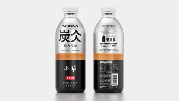
Independent branding agency Formascope has successfully completed a packaging redesign for Tanbing, a coffee product by Nongfu Spring, which is recognized as China’s largest bottled water company. This project reflects the growing trend of coffee consumption in China, which has transformed into a fashionable lifestyle choice.
Enhancing Consumer Experience Through Thoughtful Design
Founded in 1996, Nongfu Spring acknowledged the necessity for packaging that not only captivates the eye but also enriches the overall consumer experience. The new design emphasizes key elements that resonate with coffee enthusiasts, focusing on visual appeal and conceptual relevance.
Formascope identified the primary objective of the redesign as appealing to moderate coffee drinkers who appreciate coffee in both home and office environments. The packaging was crafted to be user-friendly, easy to grip, and aesthetically pleasing.
A Comprehensive Approach to Coffee Experience
The packaging design is centered on the notion of delivering a complete coffee experience. Each design element is intended to enhance consumer interaction with the product. Key visual components, including colors and shapes, are designed to evoke the essence of coffee culture, skillfully merging traditional elements with modern aesthetics and innovative typography.
The packaging is thoughtfully divided into three sections, each characterized by distinct color coding that symbolizes various facets of the coffee experience:
- Lower Section: Black, representing a coffee cup and signifying the strength of the brew.
- Middle Section: Frothy Foam, suggesting the texture and richness of a freshly brewed cup.
- Upper Section: Metallic Color, reminiscent of high-quality coffee machines, underscoring the product’s premium quality.
Streamlined Branding for Enhanced Recognition
Additionally, Formascope introduced a simplified logo for TANBING, distilling it down to its fundamental components—a circle and a line—resulting in a cohesive and stable design.
According to Formascope, “the thoughtful color coding and ergonomic form contribute to an enhanced user experience, making this product a preferred choice for coffee enthusiasts seeking both quality and style.”
Related Topics:
Celestyal Expands Café Nation Coffee Bar
Vietnam’s Coffee Exports Surpass Last Year’s Earnings
Bristol Coffee Shop Blends Culture and Community


